What carbonated fizzy drink would you like – Pop, Soda, or Coke? The answer usually depends on where you come from – which means we have a strong clustered spatial pattern – which always makes for a fun map! Cartographer Alan McConchie over at Pop Vs. Soda posted this question in a survey to understand and visualize the pattern using a map.
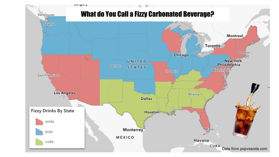
This tutorial is all about how to map spreadsheets or tables of data with some simple regional location info – such as countries, states, or zip codes – as boundary polygons on a map. You’ve seen this done dozens or hundreds of times on maps with complex demographic data or just for fun such as baby names or common search terms. In this case we’ll make a map of a spreadsheet of the regional term used for a carbonated fizzy drink based on data collected at popvssoda.com. We’ll combine that with a GIS layer of states by simply matching the state names, and display the results on a map. In technical terms, this operation is known as a table JOIN, where we link two tables using a field that shares the same attribute values (state name in this case). This relatively simple concept is fundamental to the databases that store our digital lives today. This tutorial will use this fun fizzy drink data as an example, but you can apply this technique to map any number of datasets collected at a regional level.
There are several platforms and tools to do, but this tutorial will use Esri’s ArcGIS Online, to make both a static map image as well as an interactive map that can be shared with others. ArcGIS Online is a commercial cloud-based platform, so this tutorial is targeted at students and professionals with access to the platform.
Get the Fizzy Drink Data
- Visit popvssoda.com and see the survey that is used to collect this data.
- Scroll down to the bottom left of the page to find the link to the statistics or just click here for the direct link.
- Use your mouse to select and copy the entire table of statistics including the top “header” row.
- Open Google Sheets (or MS Excel) and paste the table into the first cell (A1).
Now just a couple things to clean up the data for the map. - The last column of data doesn’t have a column name header. Enter PctTotal (one word) in cell G1.
- The first row of data just contains the totals. Go ahead and delete that row.
- This table now shows us the total number of responses for each term, but doesn’t have a column for the winner. Let’s do that now using a little formula.
- Enter TopTerm as a new column header in H1.
- Paste the formula below into H2.
=INDEX($B$1:$E$1,0,MATCH(MAX($B2:$E2),$B2:$E2,0)) - Autofill or copy & paste the cell to the rest of the data rows. You can grab the little handle at the bottom-right corner of the cell and pull down, if you don’t know that little trick.
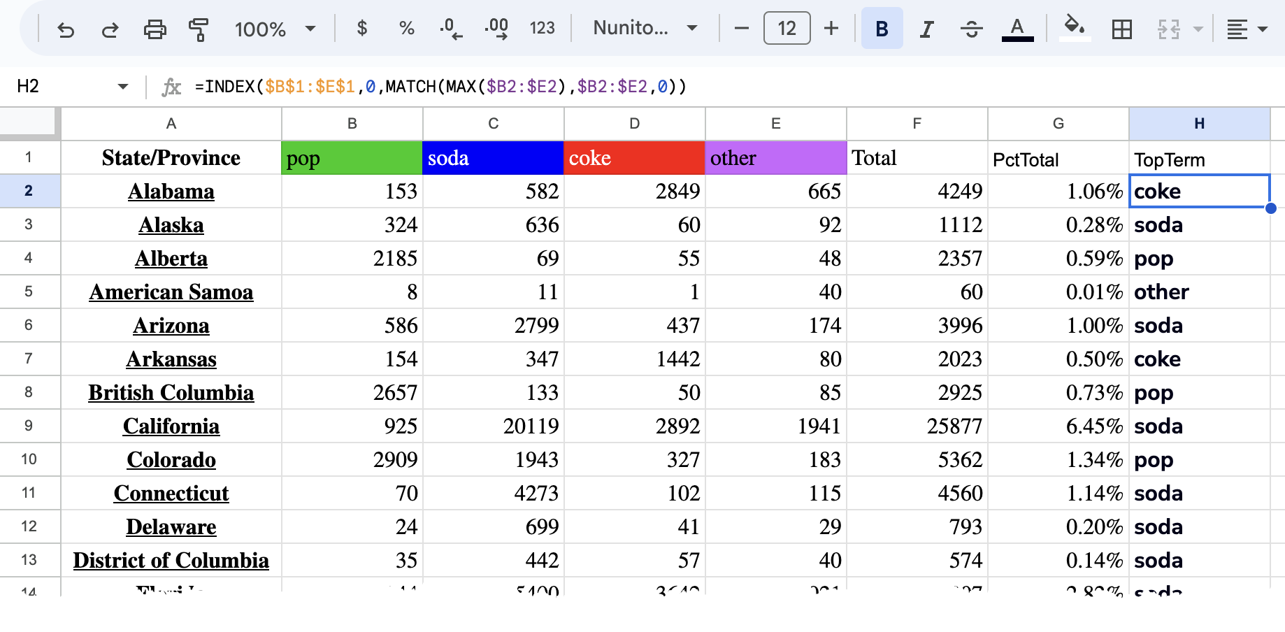
- Download the table as a .csv file (comma separated values) by going to File > Download (or Save as… in Excel) and name the file FizzyTable.csv.
Use ArcGIS Online to Map the Data
- Open the ArcGIS Online Map Viewer account and sign in.
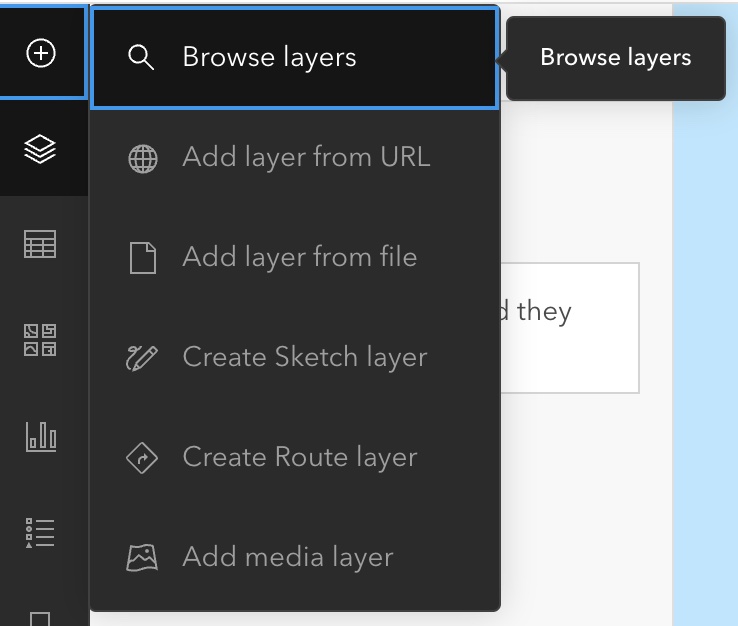
- Click the big plus button to add a layer and then select Browse layers (see screenshot)
- Change the source dropdown list from My Content to Living Atlas to browse the extensive list of Living Atlas layers curated by Esri.
- Search for USA States and add the layer named USA Census States.
- Switch to the list of layers by clicking the
 button and then click the … button next to the states layer to expand the list of options.
 - Click Show Table and explore the attribute columns for this layer. Note that there is a State Name column. Because these names will match the names in the data table, we can use them to JOIN the two tables. These columns are known as key fields and they become the “glue” for the JOIN.
- Now let’s add the csv table to ArcGIS Online. Click the Add Data button again, and select Add layer from file this time.
- Drag-and-drop or browse for FizzyTable.csv you made earlier.
- Select the Create a hosted feature layer and add to map option and click Next. Then click Next again to accept the Field names.
- Change the location type dropdown from Address and Locations to None and click Next.
- Give the table a name, tags, and summary if you’d like and click Create and add to map.
- Click the Table tool from the left toolbar and then use the … button to expand the options and show the table to see how the table was imported.
Now that we have both the state boundaries and the fizzy drink data added to our map, let’s JOIN them together so we can make maps of the fizzy drink data. - Click the Analysis button
 on the right toolbar.
 - Find the Join Features tool and click it to open the tool panel.
- Set the following parameters:
- Target Layer: USA Census States
- Join Layer: Fizzy Table
- Target Field: State Name
- Join Field: State/Province
- Join Operation: One to one
- Join Type: Inner Join
- Output Name: Fizzy Drinks By State
- Click Run to start the operation. Switch back to the Layer list panel from left toolbar (if you’re not on it already) so you can see the resulting layer when it finishes. Go ahead and hide the USA Census States layer because we won’t be needing it anymore.
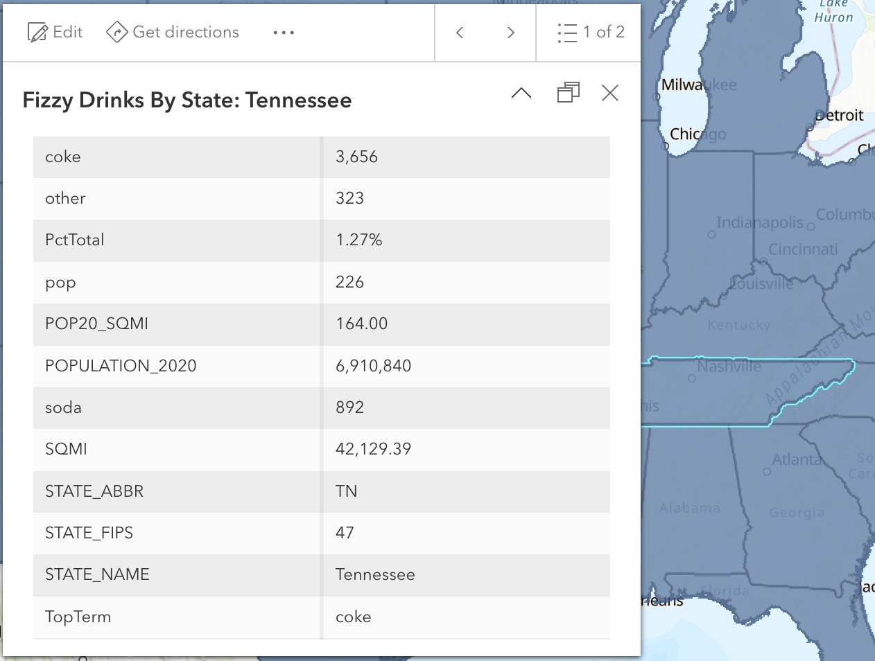
- When the Join is complete and the new layer has been added to the map, click on a state to see the popup. Note that the two sets of attributes have been joined together based on the state name.
- Now we’ll make a choropleth map of the TopTerm value for each state. Click the Fizzy Drinks By State layer in the layer list and then the Styles button
 on the right toolbar.
 - We will be styling the layer based on the TopTerm field, so click Field and then scroll to TopTerm and click the Add button. The map updates and you should instantly recognize the regional pattern!
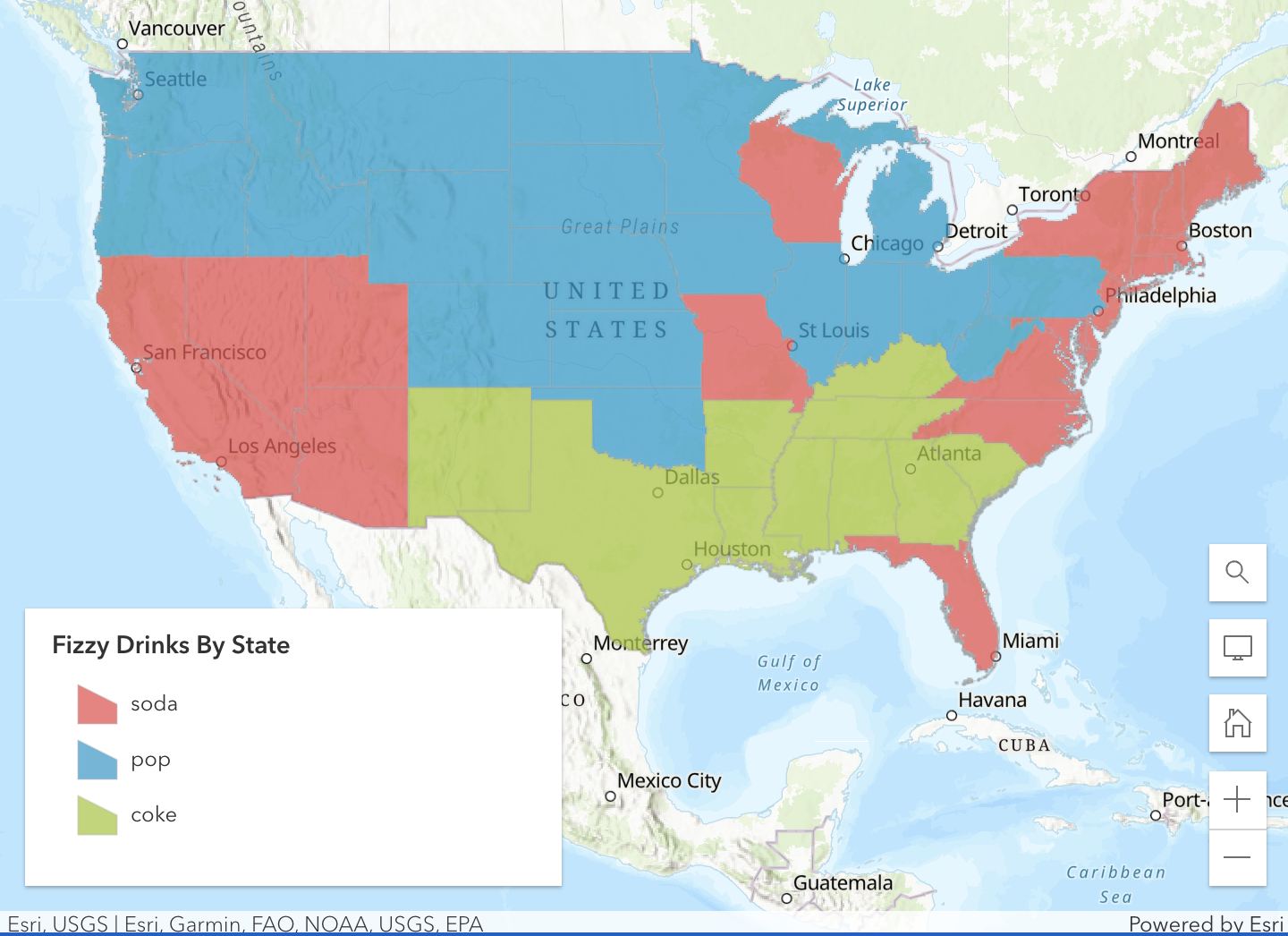
- Click the Basemaps button
 on the left toolbar and change the basemap to something more subtle. I like the Human Geography one, but choose something you like.
 - Now go back over to the Styles panel for your layer and click Style options under Types (unique symbols). Click the pencil icon next to the Symbol style and then click the Fill color palette. Choose a color palette that you like.
- You can also change the transparency, outline styles, etc.
- Save the map by clicking the Save and Open tool
 . Give it a title along with any tags and summary (optional).
Making the Map Image
The ArcGIS Online Map Viewer has some options to export/print maps by going to the Print button on the left toolbar. The layout options are pretty limited, so I usually do some screen shots of the map and legend and reassemble them into a nice layout using Photoshop, PowerPoint, or Google Slides. Here’s a quick and easy version of the result I made in Google Slides with just some text boxes and clipart.
Making the Shareable Mapping Application
A mapping application is the best way to share an interactive map with customized tools for exploring, querying, and analyzing the map and its data layers. Esri provides some great application templates that allow you to quickly and easily create beautiful shareable mapping applications.
Prepare the map
The first step to creating a web application is to “author” the map in the Map Viewer. We’ve already started this by adding the layers and giving them symbols. The application that we create will obviously have these layers and symbols, but we can also customize things such as the popups and labels as well.
- Return to the list of layers and click the Fizzy Drinks By State layer to activate it.
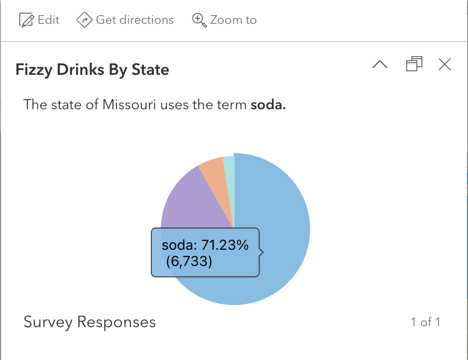
- Click the Popups tool
 on the right toolbar to open the Popups panel. A sample popup is displayed over the map. Here we can control what this popup will look like.
 - Click the Title and delete the layer name so that it just shows {STATE_NAME}. Putting squiggly brackets around a field name will show that field value in the popup. The { } button next to the textbox will give you a list of the available fields to use.
- Get rid of the Field List element in the popup by clicking the … button and selecting Delete. The Field List is a traditional way to show attribute values in a map popup, but we’re going to simply things for this map.
- Click the + Add Content button and select Text. A textbox is displayed for you to enter the text that will be displayed in the popup. You can use squiggly brackets to substitute field values in the text. You can even use html to style the text in the popup.
- Enter the text below into the text editor and click OK. Notice that a list of fields appears when you type the { key.
The state of {STATE_NAME} uses the term {TopTerm}. - In the Pop-ups panel, click the + Add Content button again and choose Chart this time. We will add a chart of the percent of the survey responses.
- Choose a Pie Chart and give it a title of Survey Responses.
- Click the Select fields button and soda, pop, coke, & other and click Done. You don’t have a lot of display options for this chart but it gives you a nicely styled chart with labels that are displayed as you hover over the pie slices.
- Save your map again.
Making the App
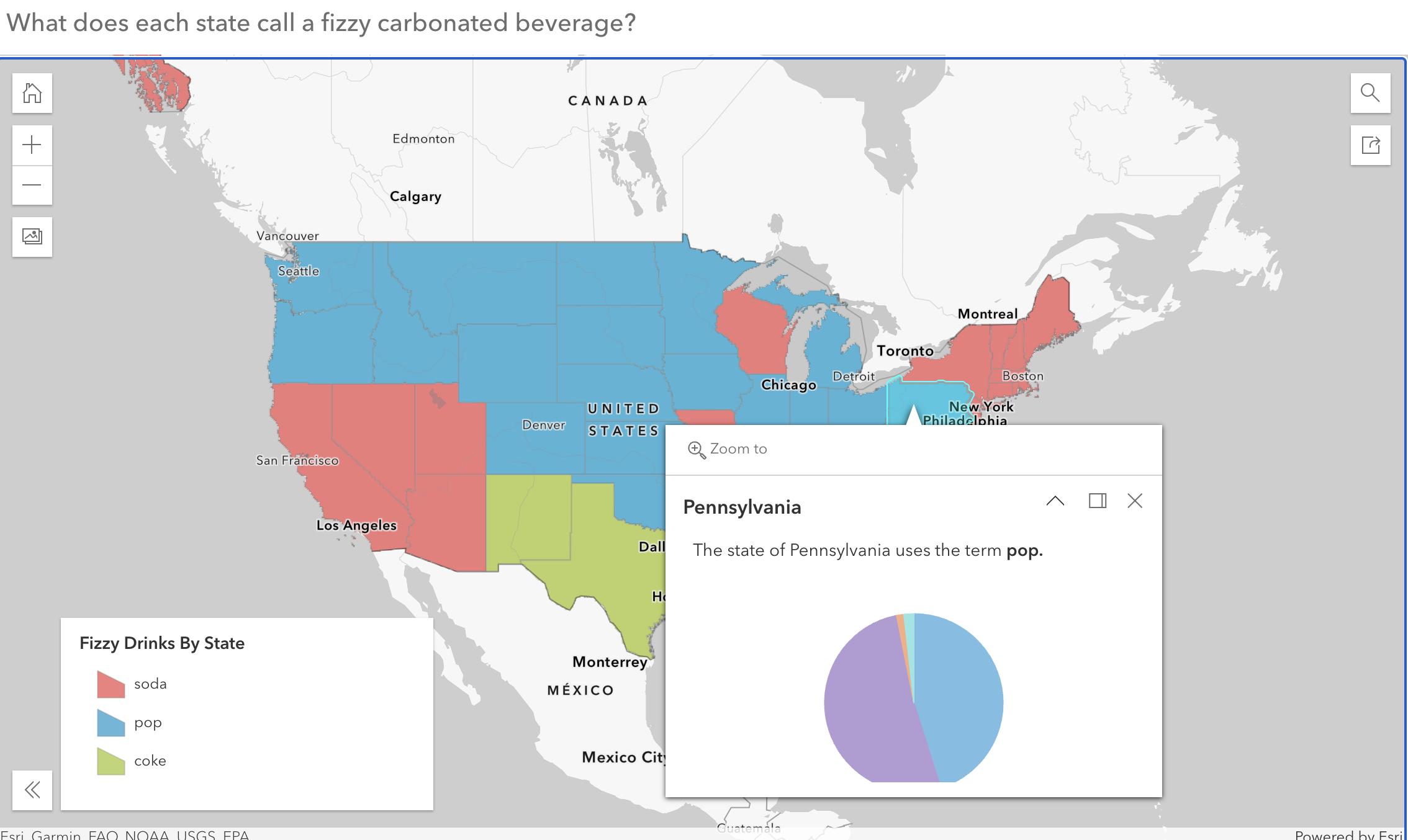
- Click the Create App button from the left toolbar and then select Instant Apps.
- Choose the Basic template and give it a name, tags, and summary.
- By default, the configuration tool opens in “Express” mode. Toggle it off by clicking the toggle at the top of the left panel. This gives you access to a few more settings.
- Click About from the left toolbar
- Toggle on the Header and give it a title – What does each state call a fizzy carbonated beverage?
- Toggle on the Legend and set it to open with the app loads (this app is pretty useless without the legend displayed).
- Click the Interactivity tool from the left toolbar.
- Explore the features available here. Try these out and feel free to customize them.
- Toggle on Screenshot and Social sharing.
- Click the Theme & Layout tool from the left toolbar.
- Explore the features available here. Try these out and feel free to customize them.
- Click Publish at the bottom of the panel whenever you are ready.
- By default, the app is not shared beyond just yourself, but you can click Change share settings to share with an ArcGIS Online group, organization, or everyone (public).
- Click Launch to see your work and copy the link to share it with your friends!
Conclusion
That’s it! We’ve quickly and easily made both a map image and interactive map that started as a simple table of data grouped by state. This is a fun example of how to use this technique, but I’m sure you can think of lots of other uses of it!
Happy Mapping!

Leave a comment